PLATE 03 — BRAND IDENTITY · WEBSITE — TEASER LIVE
Lytvyn
PROJECTLytvyn
DWG №0103
SCOPEbrand identity · website — 2026
SCALE1:1
SHEET3 OF 6
STATUSTEASER LIVE
DRAWN BYAndrew Rozhok
DATE2026.06
PLATE 03Brand Identity · Website
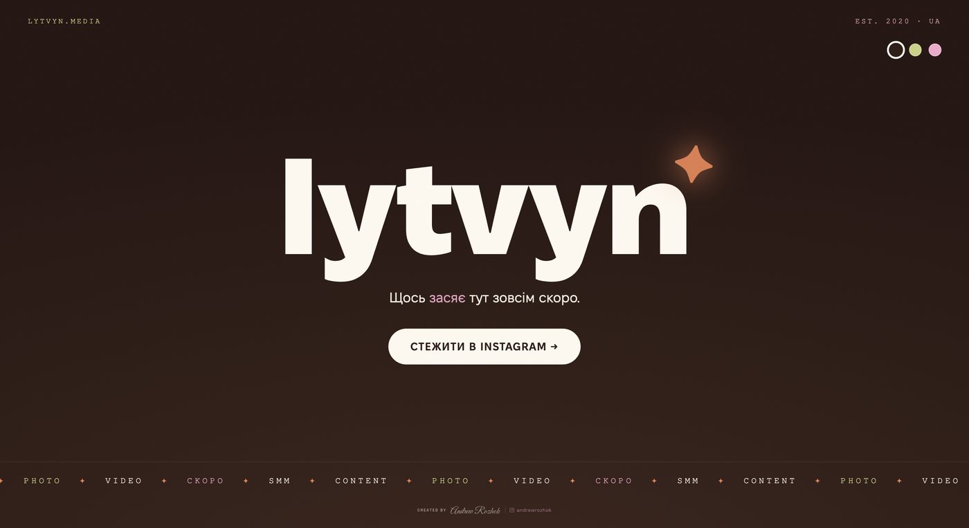
lytvyn.media
Lytvyn
brand identity · website — 2026
TEASER LIVE
VISIT LIVE TEASER — lytvyn.media →
BRIEF
Brand identity and website for Sasha Lytvyn — an SMM & content studio working in Ukrainian (lytvyn.media, est. 2020). Five-plus years of helping brands find their voice on social: strategy, content, photo and video, from idea to result. The brief had a single word at its center — засяє, “to shine” — and the whole system is built to deliver on it.
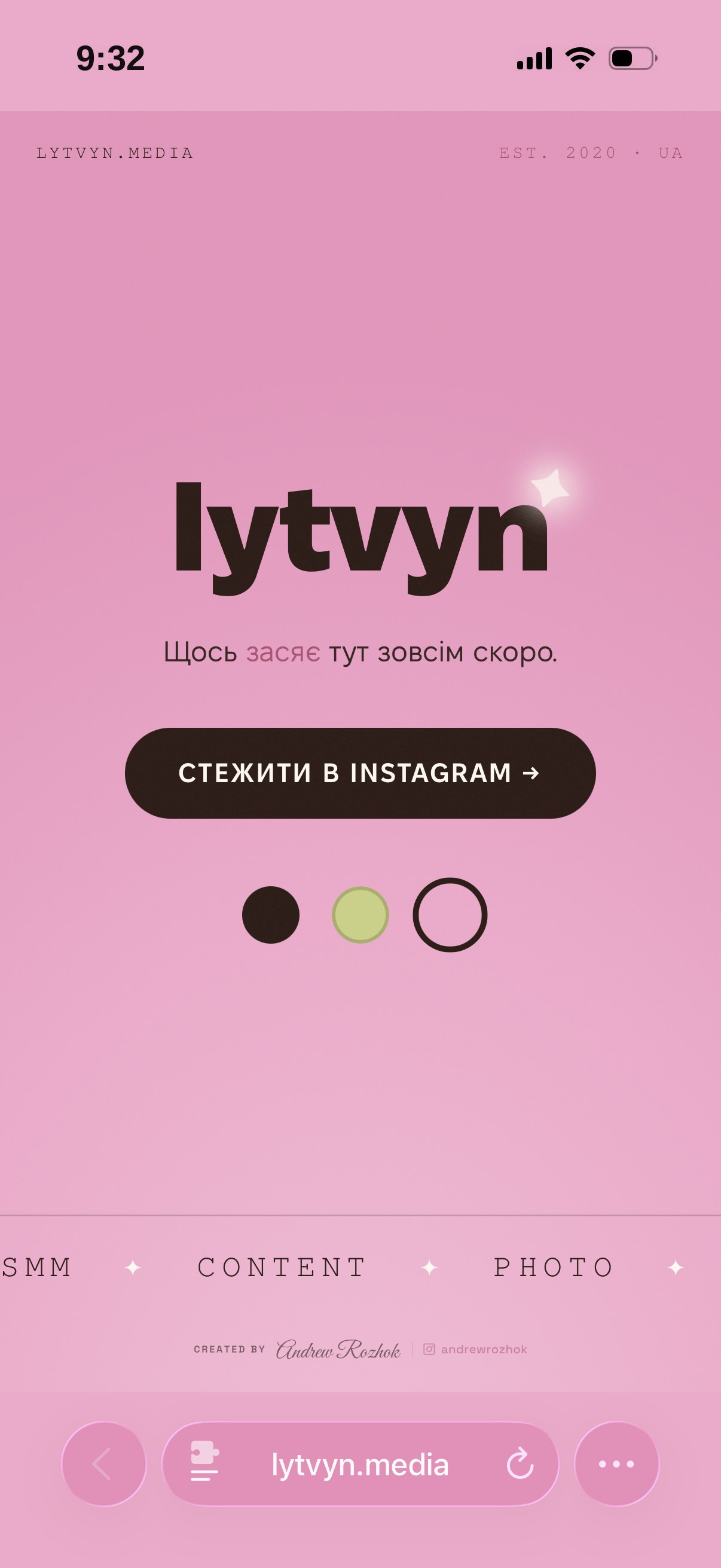
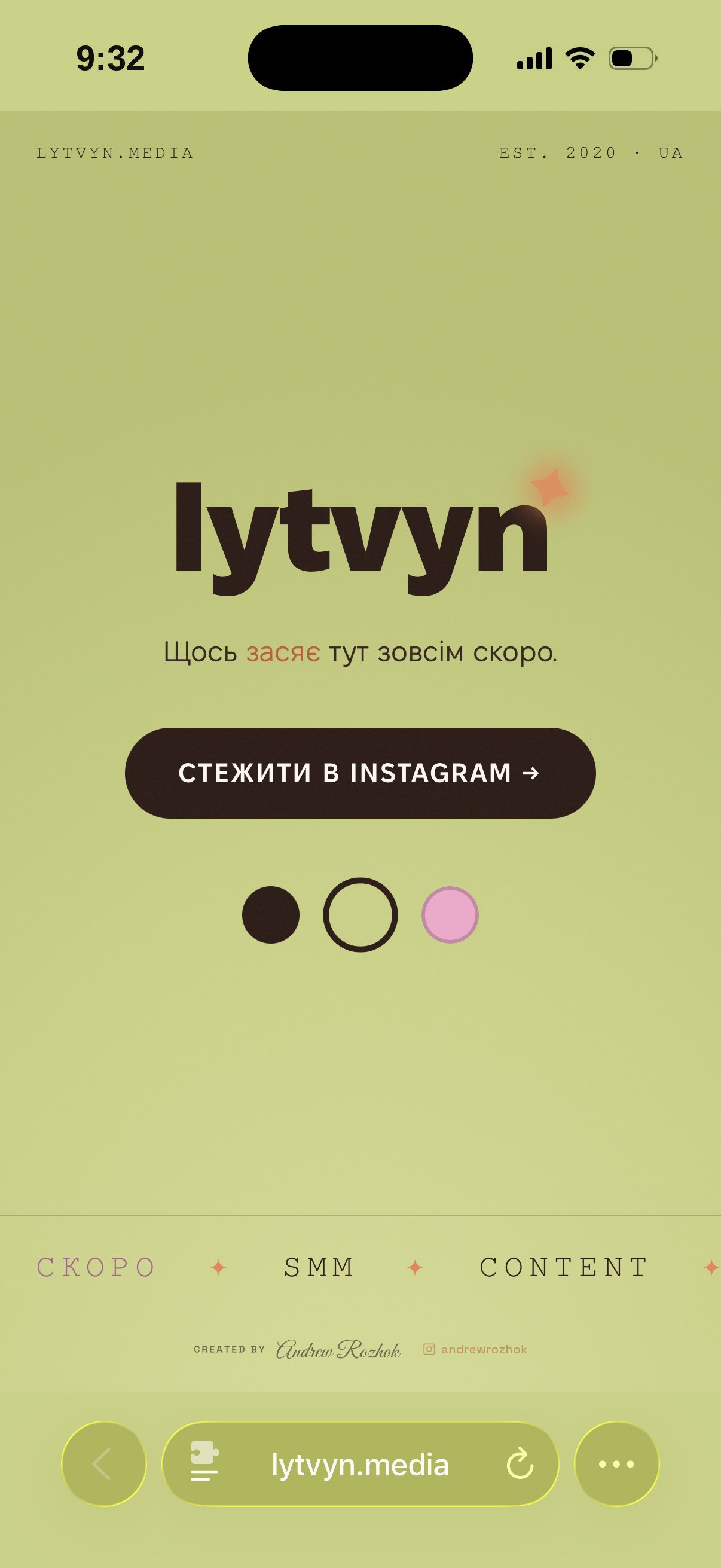
The brand book is complete and the chocolate “coming soon” teaser is live now, with the full site in production alongside the client.
PALETTE — SAMPLED
#281810#F8F8F0#C8D078#F0A0C8#F08048
Chocolate and cream hold the system — warm, grounded, a little editorial, never loud. The bright accents are rationed to the spark alone: tangerine, pistachio, and pink are the colors of the moment something starts working, so they stay meaningful instead of decorative.
PROCESS & DELIVERABLES
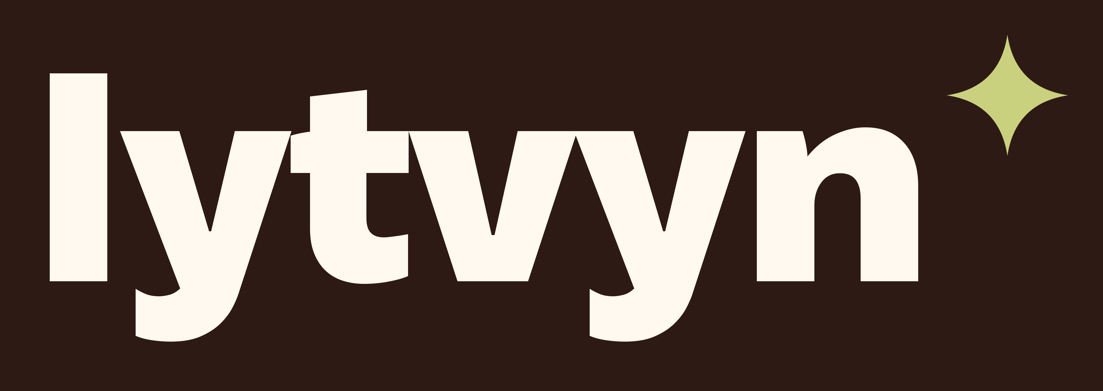
The idea in the mark. The studio’s promise is to make a brand shine, so the mark is a spark ✦ — set in the footnote-asterisk position right after the wordmark, like a note quietly explaining the point. The wordmark itself is lowercase Fixel Display Black: confident and modern with no pomp, exactly the tone of voice.
Built to be used. The kit carries an EN “lytvyn ✦” and a UA “литвин ✦” wordmark, a signature lockup for documents, a “ly ✦” avatar that survives at 40 pixels (pistachio primary, chocolate for dark campaigns), and a mono fallback. The spark is allowed to change color — tangerine, pistachio, pink — while the letters stay chocolate or cream, so the system flexes without breaking.
Social-first by design. Because the client lives on Instagram and Telegram, the brand shipped with story and highlight templates, three avatar variants, favicons, and social cards — everything needed to post on day one. The teaser pushes follows to Instagram while the full site is built.
THE MARK


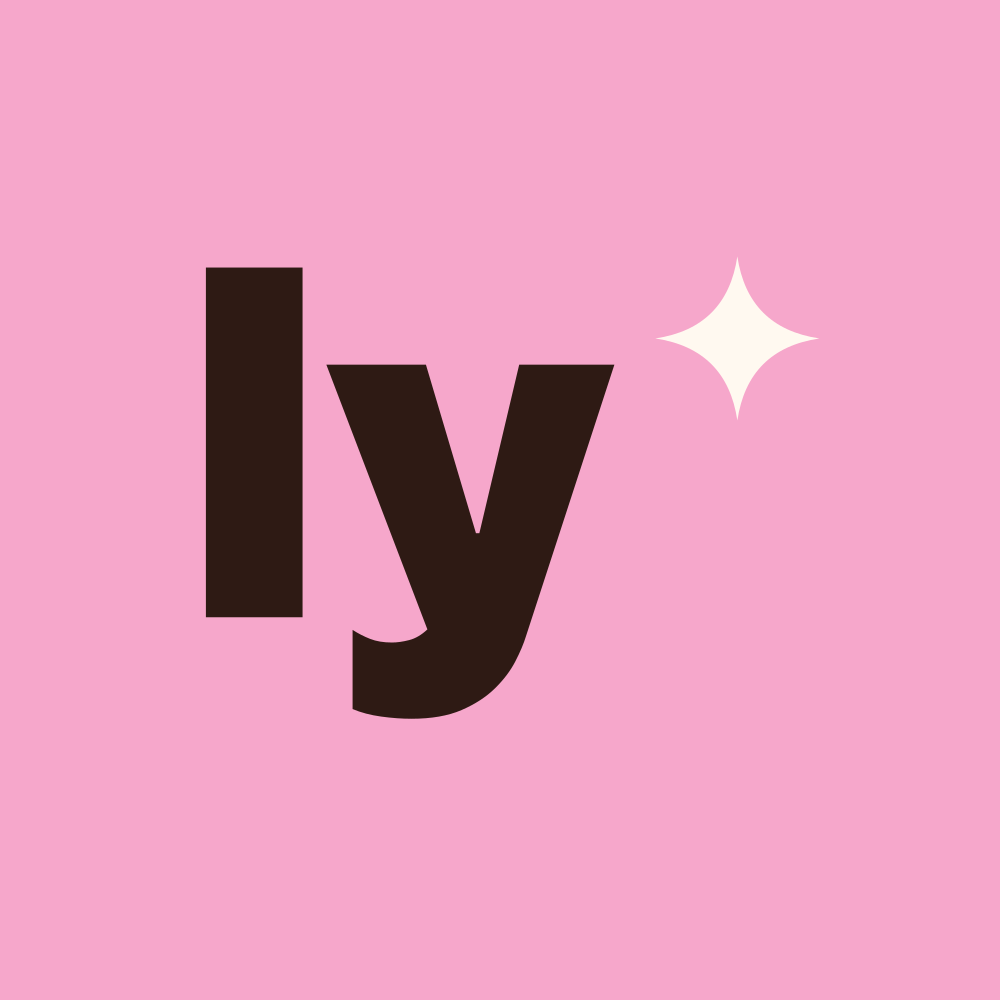
avatar — pistachio · chocolate · pink
THE TEASER — DESKTOP
lytvyn.media
↑ the “coming soon” teaser
THE TEASER — MOBILE
CAPTURED AT HANDOFF — all visuals show this project as delivered to the client. Live sites and platforms may differ from what's shown here, since clients can edit their own properties over time.